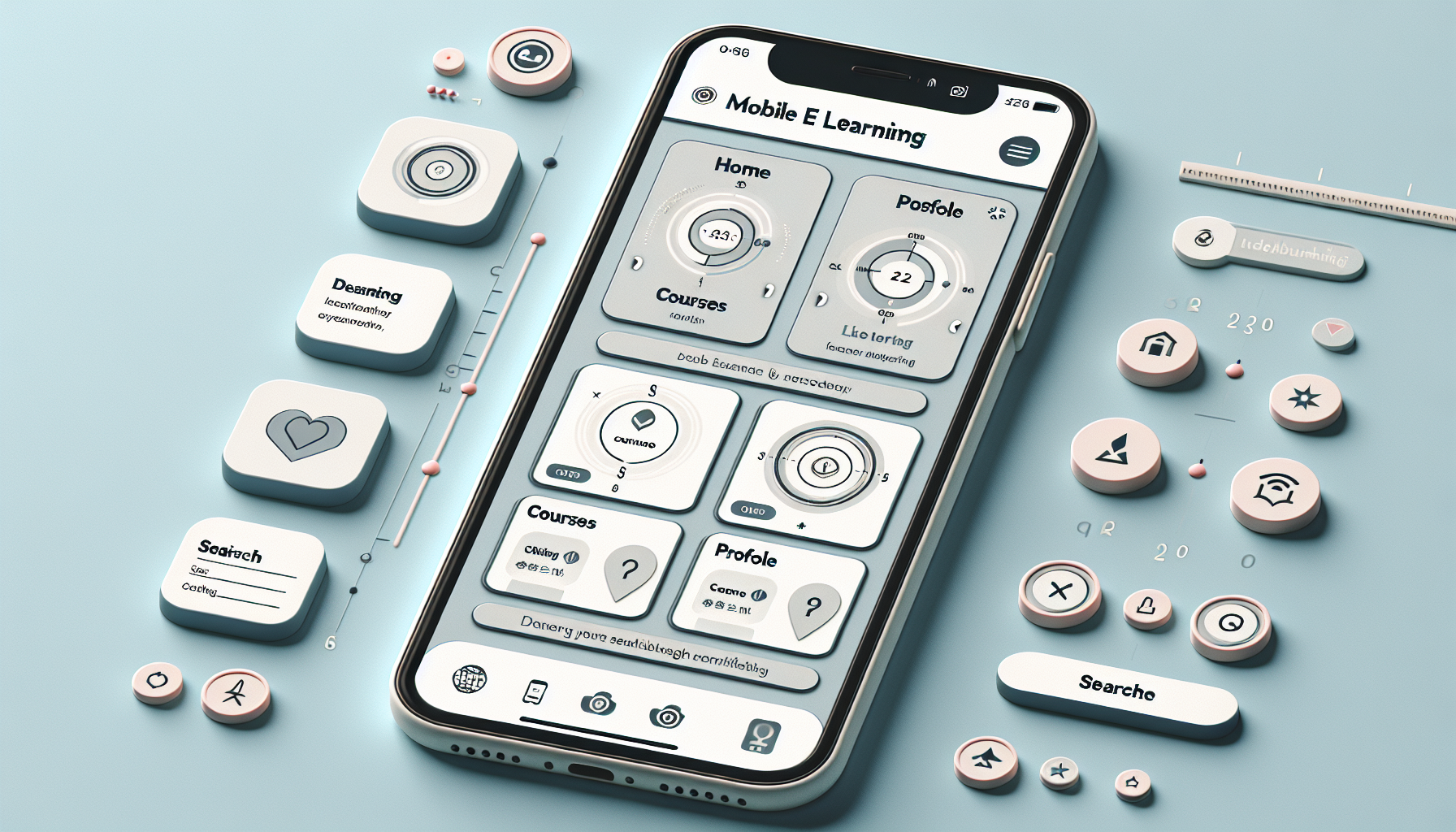
Designing mobile-first eLearning interfaces can seem like quite the puzzle, right? With everyone glued to their smartphones, there’s a lot of pressure to create engaging, user-friendly experiences that just work on small screens. It’s easy to feel overwhelmed, especially if you’re not sure where to start.
But don’t worry; you’re in the right place! By the end of this guide, you’ll have a clear roadmap to design effective mobile-first eLearning interfaces that not only meet user needs but also keep them coming back for more.
We’ll cover essential principles, understanding user expectations, design tools, and best practices to make sure your mobile learning experience shines. Let’s dive in and turn those headaches into high-fives!
Key Takeaways
- Design mobile-first by prioritizing mobile users during course development.
- Keep layouts simple and ensure quick loading times for on-the-go learners.
- Use large buttons and clear navigation to enhance user experience.
- Gather user feedback to understand their needs and preferences for effective learning.
- Utilize design tools like Adobe XD for mobile-friendly interface prototyping.
- Incorporate multimedia and interactive elements to engage users.
- Ensure responsive design for seamless usability across all devices.
- Test your design with real users regularly to refine and improve the interface.

Key Principles of Mobile-First eLearning Interface Design
Mobile-first design means prioritizing mobile devices from the start of your eLearning course development.
Since 64% of learners prefer mobile access for training, this approach is essential.
Start with a clean, simple layout that loads quickly. Remember, mobile users are often on the go and don’t have time to waste.
Use large buttons and clear calls to action to enhance navigation.
Focus on essential features that help learners achieve their goals without distractions. Less is often more.
For reference, sites such as Create a Course show how effective design can significantly improve user engagement.
Understanding User Needs for Mobile Learning
To truly cater to mobile learners, knowing what they need is vital. Start by gathering information through surveys or interviews to find out what features resonate most with them.
For instance, 75% of students find mobile learning convenient; thus, streamlining access to materials can enhance their experience.
Make sure your interface encourages peer-to-peer communication, as 65% of students appreciate this connectivity.
Considering various learning styles is crucial. Incorporate multimedia elements—videos, infographics, or quizzes—to keep things engaging.
Lastly, maintaining a responsive design is non-negotiable. This way, content adapts seamlessly whether viewed on a phone or a tablet.
Choosing the Right Design Tools for Mobile-First Development
The right tools can make or break your mobile eLearning experience. Begin by identifying your specific needs, like content type, interactivity, and user feedback requirements.
Applications like Adobe XD and Sketch are fantastic for high-fidelity prototyping and provide tools to build interfaces that are mobile-friendly.
If you prefer more straightforward solutions, consider platforms like Can Anyone Create a Course? that allow you to design without extensive technical knowledge.
Remember to include tools that facilitate collaboration and feedback from your team and potential users during development.
Using analytics tools post-launch will also help you refine your course based on actual user interactions.
Essential Elements of User-Friendly Mobile Interfaces
Creating a user-friendly mobile interface involves several key elements that enhance usability. Start by ensuring that the text is clear and legible. Use typography that stands out without straining users’ eyes.
Color contrast matters too. A color palette that’s easy on the eyes will keep users engaged longer and reduce fatigue.
Ensure that navigation is intuitive; users should never have to guess how to find information. A well-structured menu can make a big difference.
Don’t forget about interactive elements; buttons should be easily clickable and spaced appropriately to prevent misclicks.
Finally, test everything across various devices to ensure a consistent experience. After all, a great design is only great if it works everywhere.

Best Practices for Navigation in Mobile eLearning
Effective navigation is essential in mobile eLearning, as users have limited screen space and short attention spans.
Start by simplifying your navigation structure to help users find what they need without hassle.
A common layout includes a bottom navigation bar for quick access to critical sections like Home, Courses, and Profile.
Consider using icons alongside text for easy recognition. This visual aid can speed up user navigation.
Implement a search functionality that is always accessible to cater to those who know exactly what they want.
It’s also a good idea to add breadcrumbs to show users their current location within the course, enhancing their sense of direction.
Finally, gather user feedback regularly on navigation ease. This helps make continual improvements based on real user experiences.
How to Optimize Content for Mobile Screens
Optimizing content for mobile screens is all about making information easy to digest and visually appealing.
Start with breaking down information into bite-sized pieces, as mobile users often skim through content.
Utilizing bullet points or numbered lists can help highlight key points and make scanning effortless.
Embed multimedia content such as short videos or infographics, as they are proven to increase engagement.
Ensure that text is large enough to read comfortably, generally above 14px, to avoid eye strain.
Also, maintain ample white space between text blocks. It alleviates clutter and enhances the overall experience.
Finally, consider employing responsive web design so that your content looks great on any mobile device, no matter its size.
Importance of Responsive Design in eLearning
Responsive design is crucial for mobile eLearning as it guarantees that content adjusts to various screen sizes, enhancing usability.
Over 64% of learners prefer training on mobile devices, highlighting the need for a seamless experience across different platforms.
This design approach allows for consistent font sizes and element alignment, making interaction easy, regardless of the device used.
A responsive layout not only improves visual experience but also increases retention rates by keeping learners engaged.
Use CSS media queries to change styling based on the device’s width. This helps maintain a user-friendly interface.
Also, regularly test your courses on multiple devices to ensure a consistent look and feel for all learners.
As mobile usage increases, adopting responsive design is not optional—it’s essential for effective learning.
Testing and Iterating Your Mobile eLearning Interface
Testing and iterating your mobile eLearning interface is key to achieving a user-friendly design that meets your learners’ needs.
Start by conducting usability testing with real users to gather genuine insights on their experience navigating your course.
Utilize tools like Google Analytics to track user behavior and identify any pain points within your interface.
Consider conducting A/B testing to find out which design elements attract more engagement; this can help you make informed choices.
Gather feedback through surveys or usability sessions, and be open to making changes based on what you learn.
Regular iterations can significantly enhance the learning experience. You might be surprised what tweaks can do!
Remember, testing doesn’t stop once your course goes live. Continually seek feedback and make updates to adapt to users’ evolving needs.

Case Studies: Successful Mobile-First eLearning Interfaces
Looking at real-world examples can provide valuable insights into effective mobile-first eLearning design.
Take a look at the Lynda.com app, which cleverly integrates seamless navigation and engaging multimedia elements.
This platform ensures users can access training modules easily, with a beautifully responsive design that adapts to various devices.
Another great case is the Edmodo platform, which emphasizes community learning and social engagement directly through its interface.
Users can easily connect with peers, participate in discussions, and share resources, making it feel more interactive and collaborative.
Lastly, the Coursera mobile app provides an excellent example of efficient content organization.
Their smart use of progress tracking keeps learners motivated and informed, showcasing how essential features can enhance the learning journey.
Future Trends in Mobile-First eLearning Design
The landscape of mobile-first eLearning is ever-evolving, and staying ahead of trends is essential for success.
One significant trend is the increased use of Artificial Intelligence in learning platforms. AI can provide personalized learning experiences by suggesting courses based on user behavior and preferences.
Another trend to watch is gamification. More courses are incorporating game-like elements to boost engagement and motivation in learners.
This could be anything from earning badges for completing modules to incorporating quizzes that reward points.
Augmented Reality (AR) is also gaining traction in mobile learning. It allows interactive experiences, enriching content, and helping learners visualize complex concepts.
Lastly, as 5G technology becomes more widespread, we can expect faster loading times and improved streaming for high-quality visual content, making learning on mobile devices even more efficient.
FAQs
Mobile-first design prioritizes creating interfaces for mobile devices before adapting them for larger screens. This approach ensures that content and functionality are optimized for smaller displays, enhancing the user experience for mobile learners.
To optimize content for mobile screens, use responsive design techniques, concise text, clear visuals, and touch-friendly interfaces. Prioritize essential information and functionalities, ensuring they are easily accessible on smaller displays.
Key elements of a user-friendly mobile interface include intuitive navigation, responsive design, minimalistic layouts, touch-target accessibility, and engaging content. These elements improve usability and enhance the learning experience for users on mobile devices.
Testing is crucial for mobile eLearning interfaces to identify usability issues, gather user feedback, and ensure functionality across various devices. Iterative testing leads to improvements, enhancing the overall learning experience and user satisfaction.
